The work that moves people - and moves products - isn't decoration. It's a system with rules: how elements relate to each other, how information is weighted, how a user's eye and attention are guided toward what matters.
Across ESPN's global sports platform, Yardbarker's multi-site ad network, and my own pre-AI content company, the discipline was the same: build something that works at scale because it follows consistent principles, not because it got individually polished.
Blurbity - Founder
2012 - Before the tools existed
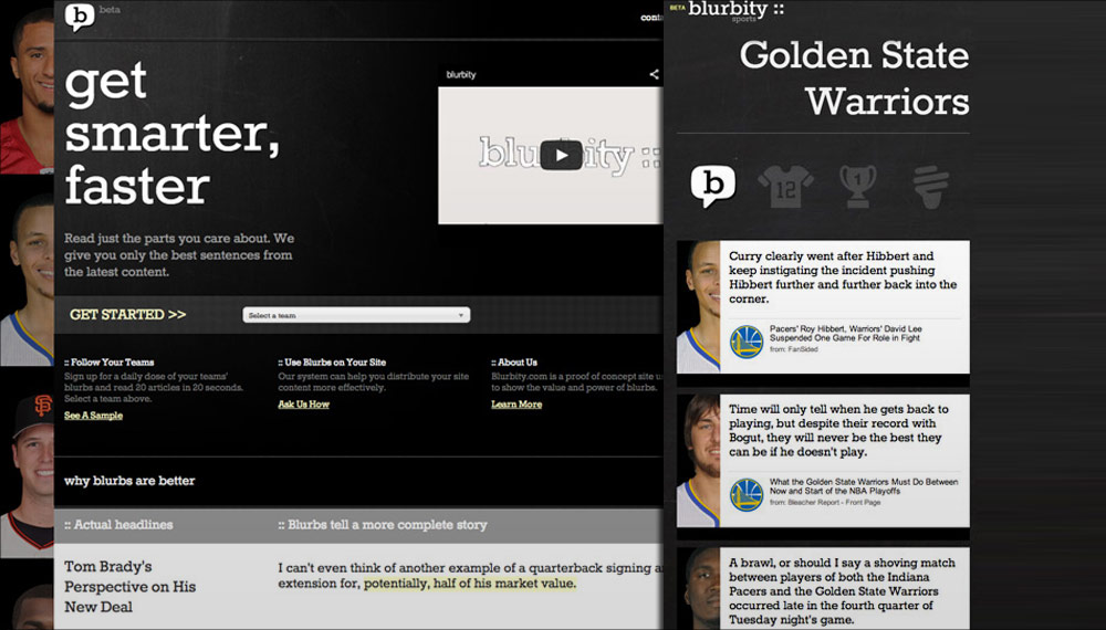
In 2012, before transformer-based LLMs and generative AI became mainstream, I built Blurbity - a blog-scraping scoring engine designed to surface the one sentence in any article that a careful reader would flag as the most important thing they learned.
Entirely rule-based: position score, complexity score, keyword signals. The tools available were statistical. The question was whether they could approximate something a reader would recognize as signal.
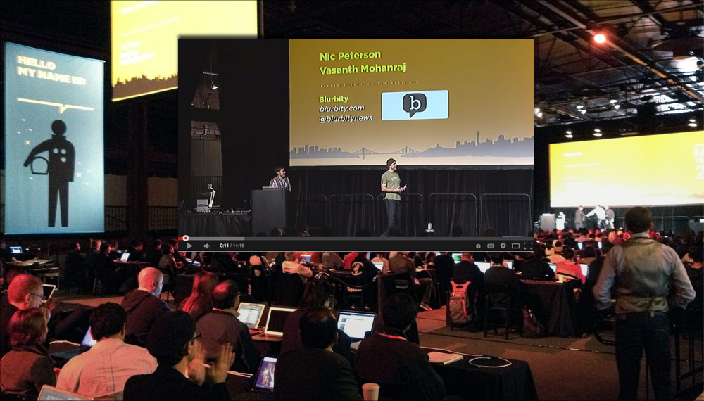
Blurbity was selected to pitch on stage at LAUNCH Festival 2013 in San Francisco - Jason Calacanis's Techcrunch Disrupt spinoff for early-stage startups.
The problem it solved - surfacing what matters inside a body of information - is the same problem that now drives clinical summarization tools, AI research assistants, and large language models.
Building this in 2012 forced a rigorous answer to a question that's now embedded everywhere: what does "important" actually mean for a content?
ESPN - Product Designer & Front-End Developer

ESPN.com in its peak years was one of the most-visited destinations on the web - tens of millions of users arriving every day for scores, highlights, and analysis. My role was to make original sections of that platform: conceiving, designing, and building them end-to-end, from initial brief to production HTML and CSS.
The design challenge wasn't producing attractive pages. It was building interactive experiences that changed how sports fans engaged with information - and doing it inside a product where the technical constraints were strict and the audience expectations were high.
The Hall of Fame E-Ticket - Building an Immersive Interactive From Raw Photos
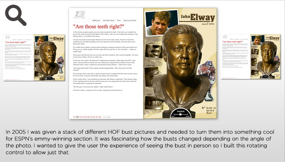
The NFL Hall of Fame induction is one of the biggest moments in the sports calendar. ESPN wanted something more than a photo gallery - it needed to be an experience. I was handed a set of photos of Hall of Fame busts from different angles and given latitude to build whatever I thought could work.
The problem with the brief: Still images of bronze busts aren't inherently compelling. The visual language of the content - weighty, historical, sculptural - needed to be matched by the interactive design rather than overridden by it.
What I built: An interactive Flash experience letting users rotate through each inductee's bust, paired with career narrative, stats, and contextual video. The design used depth and motion to make the sculptural quality of the busts work for the experience rather than against it - the weight of the material communicated the weight of the honor.
The same constraint applied to a print project for the University of Washington Athletic Department - handed a set of raw photos and tasked with producing a cohesive media guide visual system. Different medium, same problem: make the assets you have into something that feels intentional, not assembled.
Original Sections - EXPN, Page 2, and the Fantasy Platform
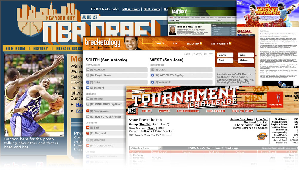
ESPN's brand umbrella covers audiences that don't overlap. Mainstream sports fans and action sports fans have different aesthetic expectations, different content rhythms, and different tolerances for editorial voice. EXPN - ESPN's action sports property - required a visual identity that could coexist with the ESPN brand without being absorbed by it.
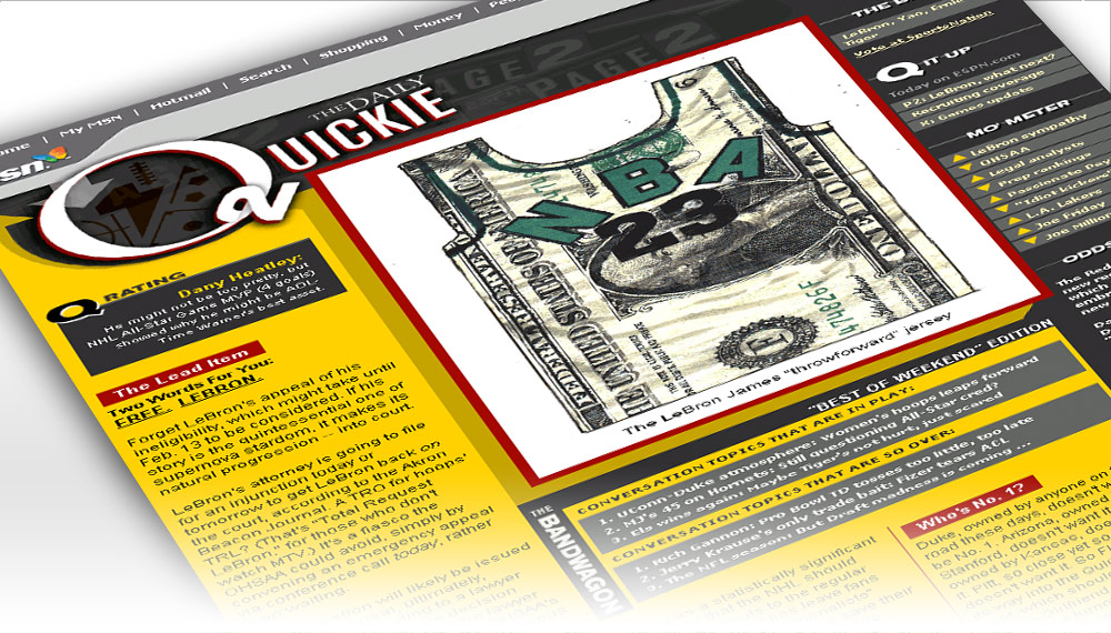
Page 2 had a different problem: it was a home for ESPN's most opinionated writers, and the design needed to signal that the editorial rules were different here - more personality, more voice, less scoreboard formality. I conceived and built the page structure that became the template for the section.
The Fantasy Games platform was scale at a different level - millions of users making decisions with real stakes. Design choices there were about reducing friction at decision points rather than expressing visual personality.
Advertising Partnerships - Making Brand Integration Work at ESPN Scale
ESPN's advertising relationships included the largest brands in the world - GM, Mercedes, Coca-Cola - and their agencies. Integrating those brands into the editorial environment without degrading the user experience required designing within tight constraints in both directions: the brand needed visibility and the editorial team needed integrity.
The work was partly creative - building ad units and sponsorship executions that felt native to the section they lived in - and partly systemic. Scaled to ESPN's traffic, even small improvements in click-through or engagement had material value. The design discipline was the same as editorial work: the unit had to earn a user's attention, not demand it.
Yardbarker - Visual Lead
Yardbarker was three products in one: a sports news aggregator, an athlete-authored blog platform, and a display ad network that ran across hundreds of publisher sites. The visual challenge of the ad network was the defining one - how do you create coherence across an inventory that lives on hundreds of surfaces you don't control?
My answer was to treat the ad system as a design system: shared rules for layout, typography, image treatment, and color that could produce consistent work even when the underlying content varied. The output would look like it came from one place, even when it was assembled from many.
A Unified Visual Language for a Distributed Ad Network
An ad network that looks different on every site is an ad network with no brand equity. Advertisers buying into Yardbarker's network needed to know what they were getting - not just reach numbers, but a consistent creative environment that their brand would sit inside.
I built the visual system that governed how ads looked across the network: rules for type, image sizing and cropping, color application, whitespace. The system was designed to be applied by others without me in the room - documented enough to produce consistent results at volume, flexible enough to accommodate the variety of content categories the network covered.
Content Sponsorships - Conceived, Sold, and Built
Display advertising at Yardbarker's scale was a commodity - sports content networks were common, and banner CPMs reflected that. The differentiation opportunity was content that brands would pay a premium for because it looked and felt like editorial rather than advertising.
I developed a content sponsorship model for Gatorade, Coors, and Gillette - not banners placed next to content, but sponsored content units that were designed to fit the editorial context they lived in. The work was genuinely three-part: I conceived the format, sold it to the brand or its agency, and then built the executions. That full-cycle ownership meant the product I sold was the product I delivered.
The Athlete Blog Platform - Designing for Voice
The athlete blog platform was a different design problem from the news aggregator or the ad network. Athletes are not professional writers. The platform needed to make unpolished content look intentional - to give the user's attention a reason to stay even when the writing was raw, because the perspective was something they couldn't get anywhere else.
The design answer was a set of templates that framed athlete voice as a feature rather than a limitation: big names, big photos, minimal interface chrome. The platform didn't try to compete with ESPN's editorial production. It competed on access - you're reading what the athlete actually thinks, not a paraphrase of what they told a reporter.
The through-line
A Hall of Fame interactive on ESPN.com, a unified visual system for a distributed sports ad network, and a pre-AI sentence scoring engine built from statistical principles - these look like very different things.
The underlying discipline is the same. Every one of them required defining consistent rules - visual, architectural, logical - and then applying those rules at a scale that no amount of individual polish could reach. A system that produces good results reliably is more valuable than a one-off that performs perfectly once.
The other constant: ownership across the full cycle. At Yardbarker I conceived the content sponsorship format, sold it to the brand, and built the executions. At ESPN I took a brief and shipped production HTML. At Blurbity I built the algorithm, designed the product, and pitched it on stage. The range is the point - not a generalist who does everything adequately, but a practitioner who can operate across the cycle because the same design thinking applies in each phase.